Editor Guide
Understand the main controls and how to make icons that read well.
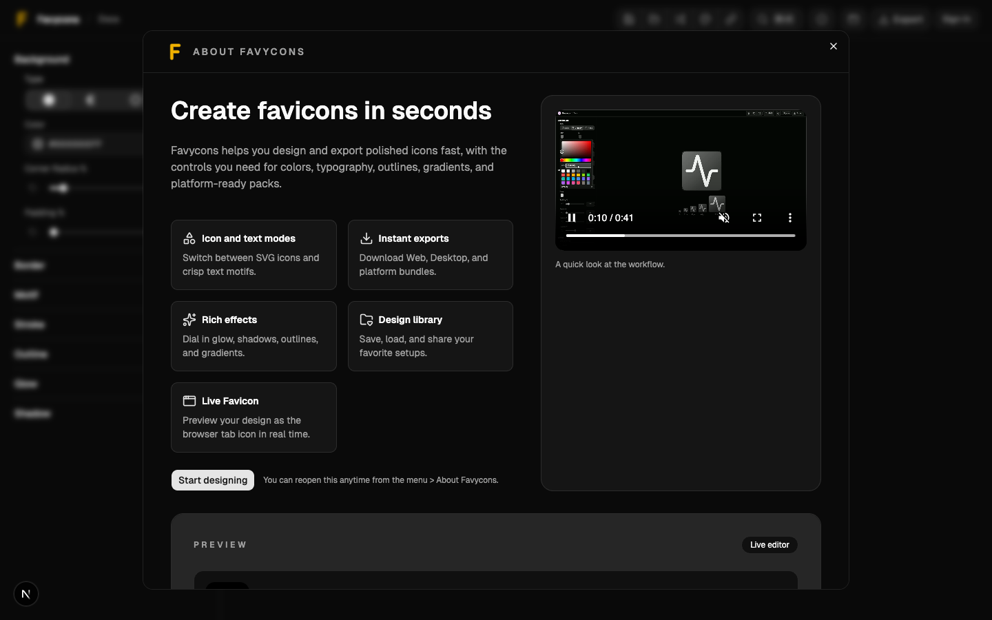
Editor Guide
The editor is built around one idea: make something that still looks good at 16–32px.
Key Controls
Most designs come down to a few knobs:
- Background: solid or gradient
- Motif: icon (SVG) or character
- Padding and scale
- Foreground color
- Optional effects: stroke, outline, glow, shadow
A Practical Workflow
- Start with a simple background + a single color motif.
- Adjust padding until the icon has breathing room.
- Only then add effects (outline/glow/shadow) if it still reads small.
- Export and verify in the real surface (browser tab, iOS home screen, Android launcher).
Tips That Prevent 90% of Issues
- If it feels “blurry” at small sizes, you often need more contrast and more padding.
- Thin strokes disappear at 16px. Prefer fewer details.
- Gradients can look muddy at small sizes. Use them sparingly.
Editor Overview
The editor: header actions at the top, controls on the side, and the live preview.